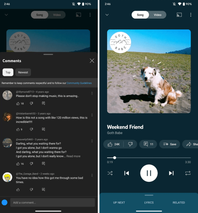
YouTube Music has recently revamped its “Now Playing” screen, introducing a prominent comments section as its standout feature, allowing users to both read and write comments directly within the app. The latest update also brings user-friendly buttons, larger cover art, and additional enhancements.
According to a spokesperson from the company, this redesigned interface is currently being rolled out to both iOS and Android devices.
In a discovery made by 9to5Google, YouTube Music has introduced a new comments button, which displays comments from the official music video on YouTube. Users are now able to contribute their own comments, fostering a more interactive and social experience within the app.
The comment button is conveniently located beneath the cover art, and upon selection, a panel slides up onto the screen. Adjacent to the comments, users will find icons for actions such as liking/disliking, saving, sharing, downloading, and creating radio stations. These buttons were previously hidden and only accessible by tapping on the album cover, but their relocation beneath the song title streamlines accessibility.
One minor change to note is that the song/video toggle has shifted to a white color scheme, departing from its previous background-matching design.
This redesign follows the introduction of “Samples,” YouTube Music’s new feature resembling TikTok-style short-form personalized video feeds. “Samples” showcases YouTube’s vast catalog of official music videos and live footage, offering users an immersive and dynamic music experience.


